The inspiration from Ray Shoesmith's character
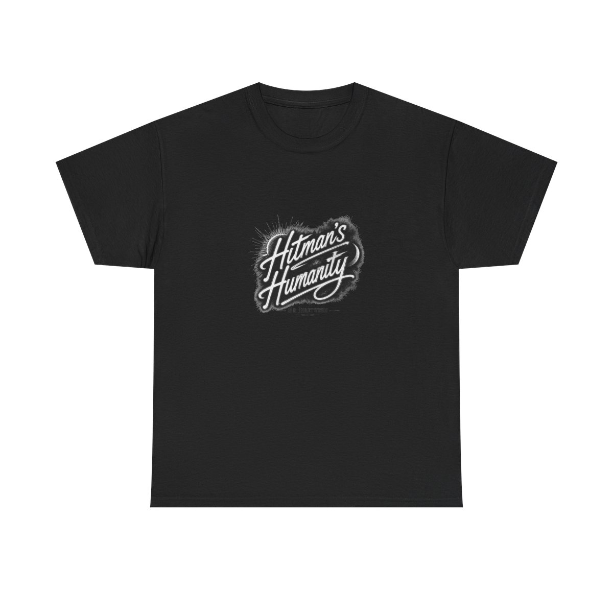
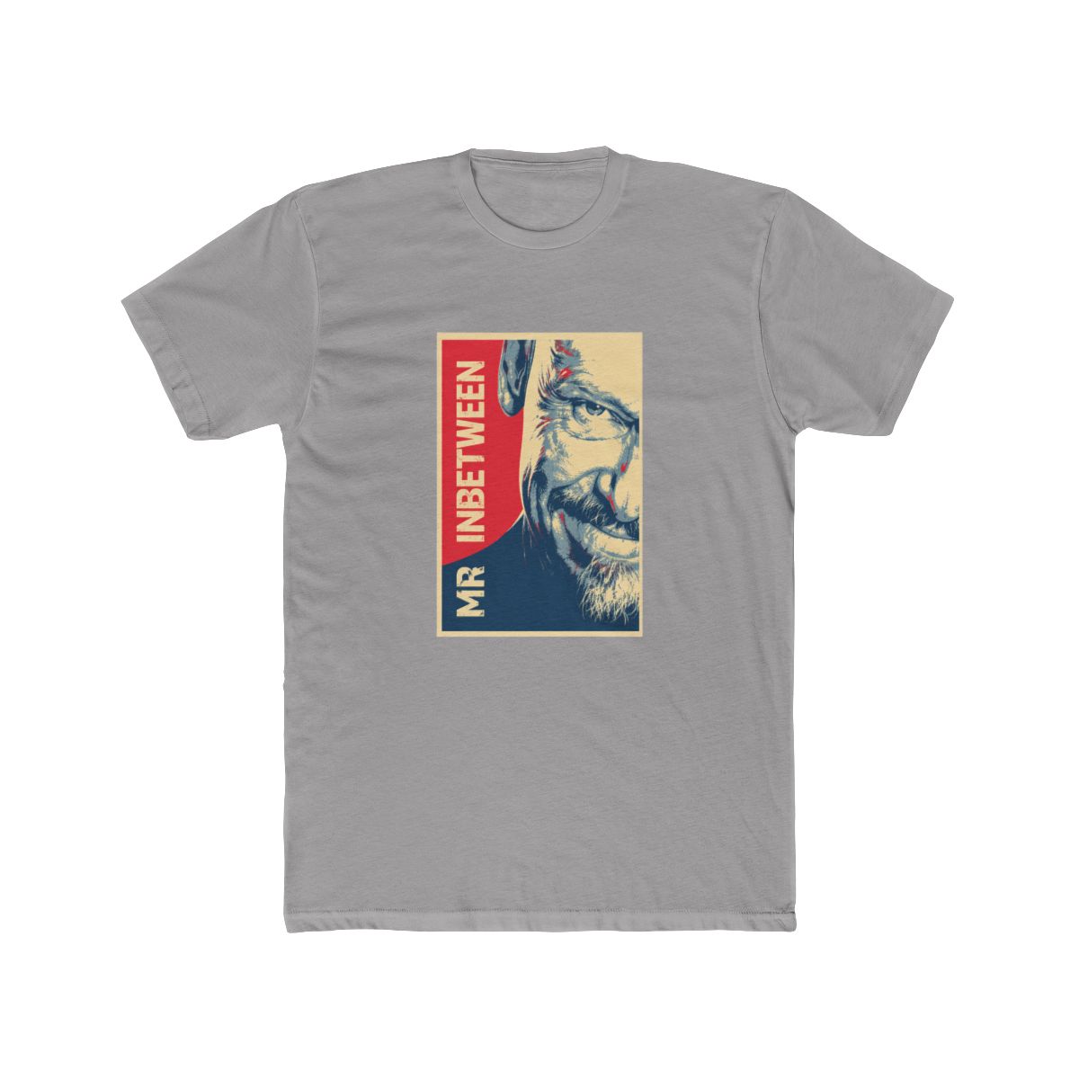
Every design in our Mr Inbetween collection starts with Ray Shoesmith. His character is a masterclass in contradictions - a hitman who reads bedtime stories, a tough guy with a soft spot for his dog. We lean into that duality. When we sketch new merch ideas, we ask ourselves: Would Ray wear this? Not in a costume way, but as something that fits his understated style. His wardrobe is almost uniform - jeans, boots, a dark shirt, and a jacket that means business. That simplicity is surprisingly hard to capture. We strip away the fluff until only the essential elements remain, just like Ray does when he handles a problem.
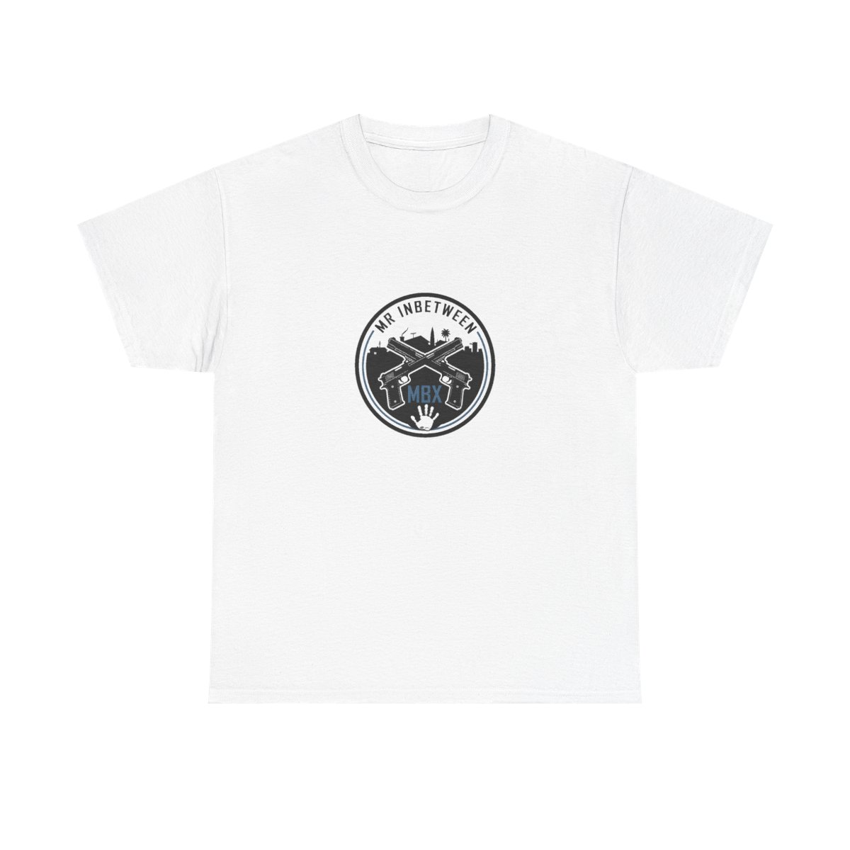
The show's creator, Scott Ryan, built Ray as a character who never says more than necessary. Our designs follow that same principle. Graphics are clean, lines are sharp, and text is rare. When we do use quotes, they are the ones that carry weight - like "That's a gray area," or "Good morning" in that flat tone. We avoid anything too flashy because Ray would never wear a neon logo. The color palette draws from the show's gritty Sydney locations: muted blues, grays, and earthy tones. It is a merchant that feels like an extension of the character, not a billboard.